jsfx-ui-lib
Custom graphics
At some point you might want to draw your own display (or even create custom components by defining a function) while fitting in with the layout logic provided by the UI library. These are the functions to help you do that:
Geometry
You can get the current viewport size/shape using ui_left(), ui_right(), ui_top(), ui_bottom(), ui_height() and ui_width().
It might be worth noting that (similar to gfx_w and gfx_h) the right/bottom sides of the viewport (ui_right() and ui_bottom()) are slightly over the edge. If you are drawing a line down the side, you might want to use ui_right() - 1 or similar.
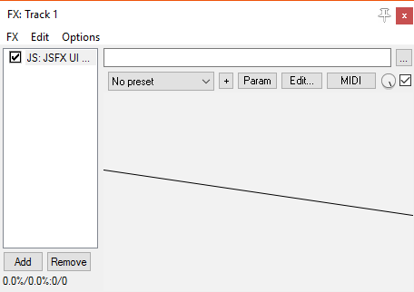
// Do some viewport manipulations
ui_push_height(50);
	// Draw a diagonal line across the current viewport
	gfx_line(ui_left(), ui_top(), ui_right(), ui_bottom());
ui_pop();
Colours
To change the current colour, use ui_color(r, g, b) or ui_colora(r, g, b, a). The RGB values are in the range (0-255), but alpha is still (0-1).
This colour is stored in the drawing-state stack, so when you pop a drawing state off from this stack, the colour is reset.
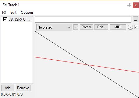
ui_push_height(50);
	ui_color(255, 0, 0);
	// This line draws in red
	gfx_line(ui_left(), ui_top(), ui_right(), ui_bottom());
ui_pop();

// This line draws in the default colour
gfx_line(ui_left(), ui_top(), ui_right(), ui_bottom());
If you change the colour using gfx_a/gfx_r/gfx_g/gfx_b, then this will be reset if you use UI library code (e.g. ui_text()).
Drawing functions
This library is focused assembling UIs, not general-purpose drawing, so it doesn’t have lots of graphics functions. However, there are some things which are common enough that they are included:
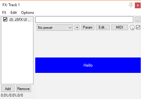
ui_fill()
Fills the current viewport with the current colour.
ui_push_height(50);
	// Fill the viewport with blue
	ui_color(0, 0, 255);
	ui_fill();
	// Draw some white text
	ui_color(255, 255, 255);
	ui_text("Hello");
ui_pop();
ui_border()
Draws a border in the current colour.
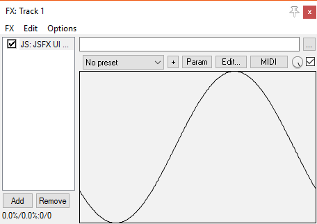
Graphing
Effects often have a display that draws some internal buffer as a graph. We therefore have two functions, ui_graph(buffer, length, y_low, y_high) and ui_graph_step(buffer, count, step, y_low, y_high), which draw the values in the buffer (scaled to the viewport size) using the current colour.
The values of y_low and y_high specify which values will be at the bottom/top of the viewport. If both values are the same, then the graph is auto-scaled, keeping this value in the centre.
ui_border();
ui_graph(buffer, buffer_length, -1, 1);
Theme functions
To help your UIs look consistent, there are some functions to help your custom controls/displays fit into the rest of the visual theme. The functions come in pairs: one draws a background, and one draws a gloss/finish.
There are five types of display, for different uses:
enabled- used by buttonsdisabled- used by disabled buttonsinset- used for meters/displayspassive- used by static non-interactive elements (e.g. navbar)technical- used for technical displays (e.g. graphs). Usually dark/black, but may be tinted.
For each of these, there is a control_background_...() and a control_finish_...() function. The background function draws a background, but also changes the current drawing colour to something suitable (as chosen by the theme).
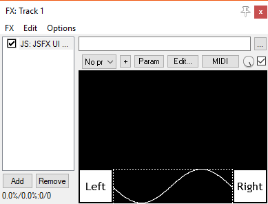
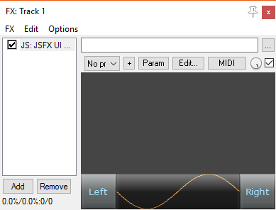
For example, here is a layout with a bottom-bar containing two buttons and a graph. The graph is a custom element, drawn using the “technical” helper functions:
ui_split_bottom(50);
	// Button on left
	ui_split_left(50);
		control_button("Left");
	ui_pop();
	// Button on right
	ui_split_right(50);
		control_button("Right");
	ui_pop();

	// Fill the rest with a graph
	control_background_technical();
	ui_graph(buffer, buffer_length, -1, 1);
	control_finish_technical();
ui_pop();
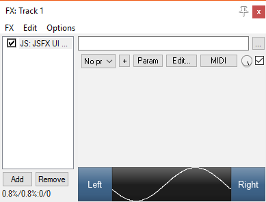
Here is the same layout, rendered with two different themes (note that the colour of the graph changes):