ui-lib.jsfx-inc
This is the API documentation for JSFX UI library. It is also available as an interactive JSFX plugin.
For more information, see GitHub or the Cockos forum topic.
Introduction
You should read the getting-started tour first (see GitHub), which explains some important concepts such as the viewport stack.
However, here are a few short examples so you know what you're dealing with:
Hello World
Here's a simple Hello World example.
We import the library in the header, and in @init we allocate it some of the memory buffer. It returns the first unused memory slot. In @gfx, we always call ui_start() first, to reset the UI state.
Then, we call ui_text() to draw some text to the screen.
Example:
desc:JSFX UI: Hello World
import ui-lib.jsfx-inc

@init
freemem = ui_setup(0);

@gfx
ui_start();
ui_text("Hello, world!");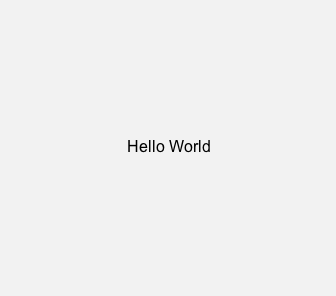
Ignoring all layout
While this library is designed to help you lay out your GUI, it's possible to ignore all the "viewport" stuff, and just use the rich controls, separate from everything else.
The key is to use ui_set_rect() or ui_push_rect() - this explicitly sets the dimensions of the viewport, which all the controls use to draw themselves.
(Do check out the layout stuff, though, in case it's useful.)Example:
desc:JSFX UI: No Layout
import ui-lib.jsfx-inc

@init
freemem = ui_setup(0);
strcpy(#text, "button text");

@gfx
ui_start();

// Set the viewport
ui_set_rect(20, 20, 200, 50);
// Draw a control
control_button(#text);

// And again
ui_set_rect(20, 100, 50, 50);
value = control_dial(value, 0, 1);

// And again
ui_set_rect(20, 180, 200, 50);
inputstate = control_textinput(#text, inputstate);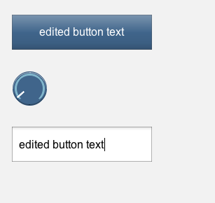
The basics
Any function named ui_*() attempts to be less opinionated about display. These functions handle layout, colours, basic text and mouse/keyboard interaction.
Setup, screens and errors
These functions provide a framework for everything else in the library.
ui_setup()ui_start()/control_start()ui_screen()ui_screen_open()ui_screen_close()ui_screen_level()ui_screen_arg()ui_system()/control_system()- The "control.prompt" screen
ui_setup()
new_freemem = ui_setup(freemem=0)freemem- index in the memory arraynew_freemem- index in the memory array
This method sets up a section of the memory buffer for use by the UI library.
You must call this in @init, before any other UI code.
Example:
@init

//Unused section of memory buffer
freemem = 0;

// Returns end of allocated block (first unused index)
freemem = ui_setup(freemem);ui_start() / control_start()
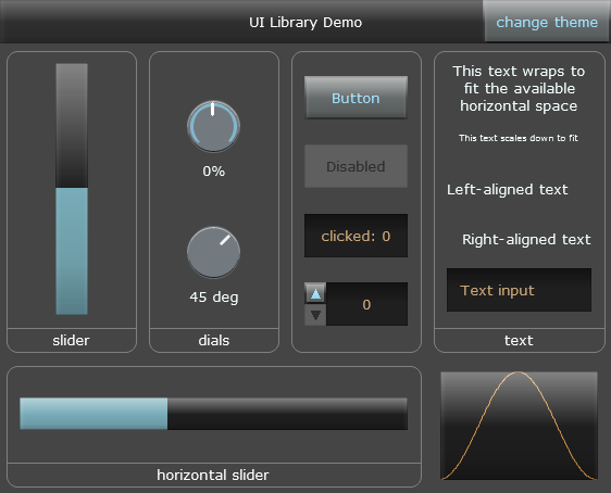
ui_start(default_screen)control_start(default_screen, theme)default_screen- default screen ID, an identifiertheme- "default", "tron" or "black"
These methods resets the UI state for the start of each frame. You must call one of these in @gfx, before any other UI code.
The default_screen variable is a screen identifier - see ui_screen().
control_start() has an additional "theme" parameter, which must be a string constant, one of: "default", "tron" or "black".
Example:
@gfx

ui_start("main");

//Or:
@gfx

control_start("main", "tron")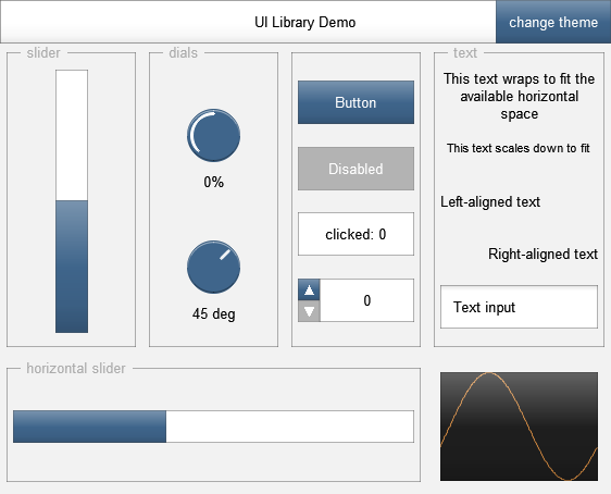
ui_screen()
This method returns the current screen ID, a unique identifier for that screen. Use this to determine which screen you should draw.
Even if you only have one screen, you should use this so that you can get error messages or other info using ui_system().
The screen ID is treated as a number, but the best screen IDs are string constants - all identical string constants are represented by the same number, and it makes your code more readable.
Example:
@gfx

ui_start("main");

ui_screen() == "main" ? (
	/* draw your main screen */
) : ui_system();ui_screen_open()
This method opens a new screen on top of the stack of screens.
The screen stack is limited to 10 layers deep.
Example:
@gfx

ui_start("main");

ui_screen() == "main" ? (
	control_button("open screen") ? (
		ui_screen_open("secondary");
	);
) : ui_screen() == "secondary" ? (
	/* draw second screen */
) : ui_system();ui_screen_close()
ui_screen_close()This function closes the current screen.
Example:
@gfx

ui_start("main");

ui_screen() == "main" ? (
	control_button("open screen") ? (
		ui_screen_open("secondary");
	);
) : ui_screen() == "secondary" ? (
	control_button("close screen") ? (
		ui_screen_close();
	);
) : ui_system();ui_screen_level()
This function tells you how many screens deep you are in your current stack. The top level is 0.
Example:
depth = ui_screen_level();ui_screen_arg()
Sets or gets the screen argument at a given index. If you pass in two arguments, it sets the value. If you only pass in one, it returns the value.
When setting values for a new screen, this must be called *after* ui_screen_open(), otherwise it will set the arguments for the current screen instead.
Example:
// Read argument for current screen
foobar = ui_screen_arg(0);

// Open new screen with argument
should_open_screen ? (
	ui_screen_open("screen2");
	ui_screen_arg(0, foobar);
);ui_system() / control_system()
These methods provide system screens.
ui_system() provides a basic error display (for unrecognised screen IDs, or errors due to incorrect use of the UI library), which is useful for developing and bugfixing.
control_system() provides an additional screen: "control.prompt", as well as a slightly prettier error screen.
Example:
@gfx

ui_start("main");

ui_screen() == "main" ? (
	/* draw your main screen */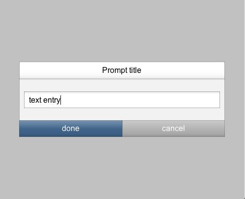
) : ui_system();The "control.prompt" screen
This is a screen ID provided by control_system(). It provides a convenient way to prompt the user for text entry.
The screen takes two arguments: a mutable string, and a title for the popup.
Example:
control_button("Open text prompt") ? (
	ui_screen_open("control.prompt");
	ui_screen_arg(0, #entered_text);
	ui_screen_arg(1, "Prompt title");
);
The viewport stack
The library keeps an internal stack of viewport/drawing states. These include viewport position (area of the screen that is currently being drawn to), colours, fonts, and so on.
Some functions modify the current drawing state (such as changing colour), but layout is generally done by pushing a new viewport/state onto the stack with the desired modifications.
When a state is popped off the stack, the active drawing state (e.g. viewport position, colours) return to their previous values.
In the code examples, we use indentation to help clarify the current depth of the stack.
Pushing, popping and splitting
ui_push()/ui_pop()ui_push_clip()- Push with height/width
- Push above/below/left/right
- Splitting the viewport
- Splitting with ratios
- Splitting with text sizes
ui_split_next()
ui_push() / ui_pop()
ui_push() pushes a new viewport/state onto the stack. The new state is a copy of the previous state, but changes to this new state do not affect the previous state.
ui_pop() removes the top later of the viewport/state stack.
Example:
// stack starts with just 1 state

ui_push();
	// stack is now 2 levels deep
	ui_color(255, 0, 255);
	ui_border(); // draws in purple
ui_pop();
// stack is now 1 deep again

// The colour change above applied
// to the state we popped off,
// so this draws in default colour
ui_text("some text");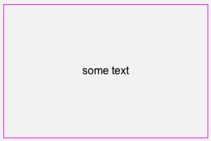
ui_push_clip()
ui_push_clip() behaves a lot like ui_push(), except all changes are clipped to the current viewport, and have a global opacity applied. If opacity is zero (or omitted), it is taken to be 1.
Internally, this is implemented by copying the current screen state to a new buffer, drawing as normal (to that buffer, using gfx_dest), and then copying back with the appropriate opacity on the matching ui_pop() call.
Example:
ui_pad(50, 50);

ui_push_clip(opacity);
	// Draw circles across the whole screen
	ui_color(0, 255, 0);
	gfx_y = 0;
	while (gfx_y < gfx_h + 30) (
		gfx_x = (gfx_y*0.5)%35;
		while (gfx_x < gfx_w + 30) (
			gfx_circle(gfx_x, gfx_y, 15, 1);
			gfx_x += 35;
		);
		gfx_y += 30;
	);
ui_pop();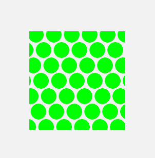
Push with height/width
ui_push_height(pixels)ui_push_heightratio(ratio)ui_push_heighttext(#text)ui_push_width(pixels)ui_push_widthratio(ratio)ui_push_widthtext(#text)pixels- integer >= 0ratio- between 0 and 1#text
These methods let you push a new viewport to the stack, with a specified height/width. Their position is determined by the current alignment.
Example:
ui_align(0.5, vertical_align);

ui_push_height(height);
	ui_border();
	ui_align(0.5, 0.5);
	ui_text("viewport has fixed height");
ui_pop();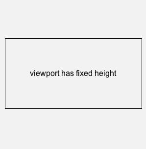
Push above/below/left/right
ui_push_above(pixels)ui_push_aboveratio(ratio)ui_push_abovetext(#text)ui_push_below(pixels)ui_push_belowratio(ratio)ui_push_belowtext(#text)ui_push_leftof(pixels)ui_push_leftofratio(ratio)ui_push_leftoftext(#text)ui_push_rightof(pixels)ui_push_rightofratio(ratio)ui_push_rightoftext(#text)pixels- integer >= 0ratio- between 0 and 1#text
These methods let you push a new viewport to the stack, fitting around the viewport that would be produced by ui_push_height() or ui_push_width().
Example:
ui_align(0.5, vertical_align);

ui_push_height(height);
	ui_border();
	ui_align(0.5, 0.5);
	ui_text("viewport has fixed height");
ui_pop();

ui_push_above(height);
	ui_color(0, 128, 255);
	ui_border();
	ui_align(0.5, 0.5);
	ui_text("centered above");
ui_pop();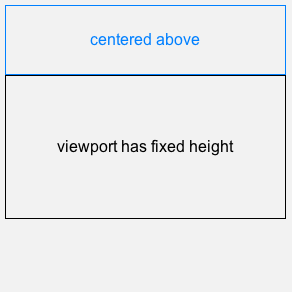
Splitting the viewport
ui_split_top(height)ui_split_bottom(height)ui_split_left(width)ui_split_right(width)height- integer >= 0width- integer >= 0
The ui_split_*() functions push a new viewport/state onto the stack, anchored to one edge. Simultaneously, they shrink the previous viewport by the same amount, so that the two do not overlap.
This gives an easy way to carve out sections of the screen to place elements, and then guarantee that other elements will not overlap with them later.
Example:
ui_split_top(height);
	ui_color(0, 192, 255);
	ui_border();
	ui_text("split viewport");
ui_pop();

// Now reduced so they don't overlap
ui_color(215, 0, 215);
ui_border();
ui_text("remaining viewport");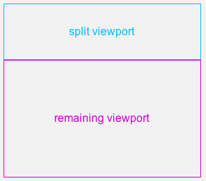
Splitting with ratios
ui_split_topratio(ratio)ui_split_bottomratio(ratio)ui_split_leftratio(ratio)ui_split_rightratio(ratio)ratio- between 0 and 1
The ui_split_*ratio() functions work exactly like the ui_split_*() functions, but with the split point specified as a ratio of the height/width.
Example:
ui_split_topratio(ratio);
	ui_color(0, 192, 255);
	ui_border();
	ui_text("split viewport");
ui_pop();

// Now reduced so they don't overlap
ui_color(215, 0, 215);
ui_border();
ui_text("remaining viewport");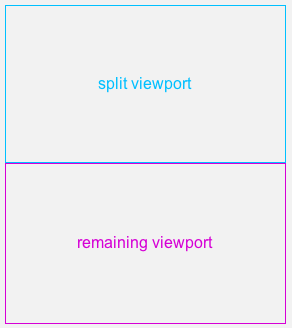
Splitting with text sizes
ui_split_toptext(#text)ui_split_bottomtext(#text)ui_split_lefttext(#text)ui_split_righttext(#text)#text
The ui_split_*ratio() functions work like the ui_split_*() functions, but the split point is determined by the height/width of a text string, plus some appropriate padding (from ui_padding() and related functions).
If you supply a negative number, it is equivalent to the empty string (which still has non-zero height).
Example:
ui_split_lefttext(#text);
	ui_color(0, 192, 255);
	ui_border();
	// Viewport fits the text neatly
	ui_text(#text);
ui_pop();

ui_color(215, 0, 215);
ui_border();
ui_text("remaining viewport");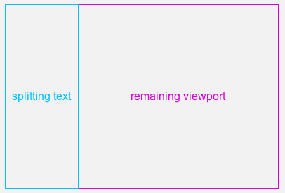
ui_split_next()
ui_split_next()When you have performed a split using any of the ui_split_*() methods, you can use ui_split_next() to pop the viewport/state from the stack, and then re-split using the same height/width.
This lets you very easily subdivide into equal-sized pieces, or stack items up from one edge.
Example:
ui_split_topratio(1/4);
	ui_color(255, 0, 0);
	ui_border();
	ui_text("first section");
ui_split_next();
	ui_color(128, 128, 0);
	ui_border();
	ui_text("second section");
ui_split_next();
	ui_color(0, 255, 0);
	ui_border();
	ui_text("third section");
ui_split_next();
	ui_color(0, 128, 255);
	ui_border();
	ui_text("fourth section");
ui_pop();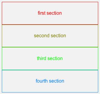
Get/set the viewport
If you want to draw a custom control/display, you can query the current viewport so that you can fit into the layout the way that other controls do. For more complicated layouts, it's sometimes useful to directly set the viewport, so there are functions for that too.
You can actually use ui_set_rect() to use the built-in rich controls without using the layout/viewport stack at all - see the "Ignoring all layout" example in the Introduction.
Get viewport position
left_x = ui_left()right_x = ui_right()top_y = ui_top()bottom_y = ui_bottom()width = ui_width()height = ui_height()left_x- integerright_x- integertop_y- integerbottom_y- integerwidth- integerheight- integer
These return the boundaries and dimensions of the current viewport.
Much like gfx_w and gfx_h, the right/bottom edges are the first pixels that are *not* included in the viewport.
Example:
ui_align(0, 0.5);
ui_textnumber(ui_left(), "%i");

ui_align(1, 0.5);
ui_textnumber(ui_right(), "%i");

ui_align(0.5, 0);
ui_textnumber(ui_top(), "%i");

ui_align(0.5, 1);
ui_textnumber(ui_bottom(), "%i");

sprintf(#size, "%i x %i", ui_width(), ui_height());
ui_align(0.5, 0.5);
ui_text(#size);

ui_border();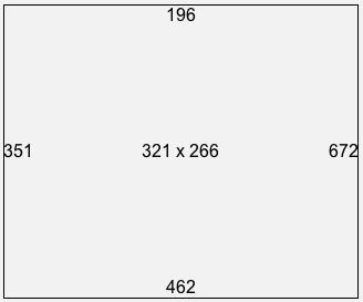
Set viewport position
ui_set_rect(left, top, width, height)left- integer >= 0top- integer >= 0width- integer >= 0height- integer >= 0
This explicitly sets the position and dimensions of the current viewport.
Example:
ui_set_rect(left, top, width, height);

ui_color(255, 0, 255, 0.5);
ui_fill();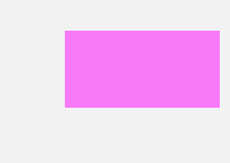
ui_push_rect()
ui_push_rect(left, top, width, height)left- integer >= 0top- integer >= 0width- integer >= 0height- integer >= 0
This is equivalent to ui_push() followed by ui_set_rect(). It's useful if what you draw also changes viewport parameters (e.g. colours, fonts), because these are reset on the corresponding ui_pop();.
Example:
ui_push_rect(left, top, width, height);
	ui_color(255, 0, 255, 0.5);
	ui_fill();
ui_pop();

// Colour is not changed
ui_text("some text");Padding
A few of the UI operations involve a default amount of padding. For example, the ui_split_*text() add padding to the text measurements to determine the split size.
This padding size is part of the viewport/drawing state, and is dealt with by these functions.
ui_pad()
ui_pad(left, top, right, bottom)ui_pad(leftAndRight, topAndBottom)ui_pad()left- integer >= 0top- integer >= 0right- integer >= 0bottom- integer >= 0leftAndRight- integer >= 0topAndBottom- integer >= 0
This function shrinks the current viewport by the specified amount.
When the padding size is omitted (in ui_pad() or in the side-specific variations), it uses a default padding size. This is also the padding size added when using ui_split_*text().
Example:
ui_border();

ui_pad(left, top, right, bottom);

ui_border();
Single-edge padding
These functions add padding on one edge only. If the length is 0, the default padding is used.
Example:
ui_border();

ui_padleft(left);
ui_padtop(top);
ui_padright(right);
ui_padbottom(bottom);

ui_border();Setting/getting the padding
ui_padding(padding_horizontal, padding_vertical)padding_horizontal = ui_padding_x()padding_vertical = ui_padding_y()padding_horizontal- integer >= 0padding_vertical- integer >= 0
These functions allow you to read or set the default padding. Different themes have different default padding sizes.
Example:
ui_border();

ui_padding(pad_x, pad_y);
ui_pad();

ui_border();Drawing state
Colour
ui_color(red, green, blue, alpha)ui_color()red- integer between 0 and 255green- integer between 0 and 255blue- integer between 0 and 255alpha- between 0 and 1
This function sets the current drawing colour. It uses RGB values in the 0-255 range, and an optional alpha in the 0-1 range.
These values are translated into the gfx_r/gfx_g/gfx_b/gfx_a variables. If ui_color() is called with no arguments, these variables are recalculated.
Example:
ui_split_topratio(0.5);
	ui_color(red, green, blue, alpha);
	ui_fill();
ui_pop();

// This is not affected
ui_text("some text");
Alignment
ui_align(horizontal, vertical)horizontal = ui_align_x()vertical = ui_align_y()horizontal- between 0 and 1vertical- between 0 and 1
These function set and read the current alignment. They are ratios, so 0 means left/top, and 1 means right/bottom.
If an out-of-range value is passed to ui_align(), it is ignored. This means you can set the alignments independently - e.g. ui_align(0, -1) will change the horizontal alignment to hard-left, but leave the vertical alignment unchanged.
Example:
ui_align(horizontal, vertical);
ui_text("aligned text");
Fonts
ui_font(#face, size, bold, italics)ui_fontface(#face)ui_fontsize(size)size = ui_fontsize()ui_fontbold(bold)ui_fontitalic(italics)ui_font()#facesize- integer between 8 and 100bold- booleanitalics- boolean
Specify the font parameters, individually or all at once.
The UI library uses font index 16, and configures this accordingly. ui_font() called with no arguments re-configures this font, in case it has been changed.
Example:
ui_font(#face, size, bold, italics);

ui_text("Hello, world!");
Drawing
Although the default colours vary, these drawing functions are theme-independent.
ui_fill()
ui_fill()Fills the viewport with the current colour.
Example:
ui_fill();
ui_image_fill()
Fills the viewport with an image, scaled and cropped to fill the whole area.
The image index is the number used in the "filename:" declaration at the top (or the index of an off-screen buffer).
Example:
ui_image_fill(0);ui_border() and others
Draws a border in the current colour.
Example:
ui_border();
Plotting graphs
ui_graph(buffer, count, offset=0, min_y, max_y)ui_graph(buffer, count, offset, wrap_length, min_y, max_y)ui_graph_step(buffer, count, step, offset=0, min_y, max_y)ui_graph_step(buffer, count, step, offset, wrap_length, min_y, max_y)buffer- index in the memory arraycount- integer >= 1offset- offset within the circular buffer, integer >= 0min_ymax_ywrap_length- length of circular buffer (defaults to == count), integer >= 1step- integer >= 1
Plots a graph from a buffer. "offset" sets the starting point, treating the buffer as circular. "wrap_length" is for when the circular buffer is longer than "count".
ui_graph() chooses a step size so that not too many points are drawn per horizontal pixel. If you need to draw every point, use ui_graph_step() with step=1.
If min_y and max_y are the same, the graph is centered around that value, and auto-scaled to fit the data.
Example:
ui_graph(buffer, 1024, min_y, max_y);

ui_color(0, 192, 255);
ui_graph_step(buffer, 16, 64, offset, min_y, max_y);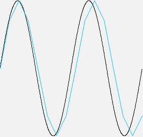
ui_reserve_image()
The UI library uses some of the offscreen buffers (0-127) for its own use. If there are any buffers (or loaded images) that you are also using, you can notify the UI library so that it avoids them.
The UI library uses buffers from the end (127 downards), so they are unlikely to clash unless you are loading a large number of images or are using offscreen buffers yourself.
Example:
@gfx

// Draw something to buffer #95
gfx_dest = 95;
gfx_drawstr("foo");

// Avoid conflict
ui_reserve_image(95);

// This resets gfx_dest, so we're fine
ui_start("main");
/* etc. */Text
Although the default fonts/etc. vary, these functions are theme-independent.
ui_text()ui_wraptext()/ui_wraptext_height()ui_texth()ui_text_width()/ui_text_height()ui_textnumber()ui_parsenumber()
ui_text()
Draws text into the viewport, using the current alignment.
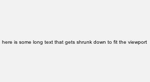
Text not wrapped, but is shrunk to fit the space if necessary.
Example:
ui_text(#text);
ui_wraptext() / ui_wraptext_height()
ui_wraptext() draws text into the viewport, using the current alignment. Text wraps, but is not shrunk to fit, so may overflow.
ui_wraptext_height() measures the text without actually drawing it (which is useful for positioning things around wrapped text).
Example:
height = ui_wraptext(#longtext);
ui_texth()
Gets the current height of a single line, resetting the gfx_* font parameters if necessary.
Example:
line_height = ui_texth();ui_text_width() / ui_text_height()
text_width = ui_text_width(#text)text_height = ui_text_height(#text)#texttext_width- integertext_height- integer
Measures the width/height of text, resetting the gfx_* font parameters if necessary.
This will return a non-zero height even for empty strings.
Example:
text_width = ui_text_width(#text);
text_height = ui_text_height(#text);ui_textnumber()
Formats a number using sprintf() formats, and draws it using ui_text().
Example:
ui_textnumber(number, #format);
ui_parsenumber()
This function parses string into a number.
It stops at the first invalid character, returning the default value if it did not find a valid number first. Whitespace is ignored.
Example:
number = ui_parsenumber(#number_string, default);User input
Mouse
For raw mouse state, you can still use mouse_x, mouse_y and mouse_cap. These functions deal with more complex interactions, like dragging and hovering.
For any function that takes a "button index" argument, it uses the standard JSFX numbers of 1=left, 2=right, 64=middle. Omitting this argument defaults to 1 (left click).
- Mouse position
ui_click()/ui_clickcount()- Mouse movement
- Mouse-down event
- Mouse-up event
- Mouse dragging
- Scroll wheel
ui_hover()ui_press()- Clear the mouse status
Mouse position
relative_x = ui_mouse_x()relative_x = ui_mouse_xratio()relative_x = ui_mouse_y()relative_y = ui_mouse_yratio()relative_xrelative_y
These functions return the mouse position relative to the current viewport, either in absolute pixels or as a ratio.
Example:
x = ui_mouse_x();
y = ui_mouse_y();
x_ratio = ui_mouse_xratio();
y_ratio = ui_mouse_yratio();ui_click() / ui_clickcount()
pressed = ui_click(button=1)count = ui_clickcount(button=1)button- 1, 2 or 64pressed- booleancount- integer >= 0
ui_click() returns whether the user clicked within this viewport, and released within this viewport. If the mouse moved outside the viewport within this time and then back in again, it still counts as a "click". It returns 0, or the duration of the click.
ui_clickcount() can be used to detect double-clicks/triple-clicks/etc.
Example:
ui_click() ? (
	ui_fill();

	last_clickcount = ui_clickcount();
);Mouse movement
Returns the mouse movement since the last frame.
Example:
dx = ui_mouse_dx();
dy = ui_mouse_dy();

// Draw mouse movement
mx = mouse_x;
my = mouse_y;
gfx_line(mx, my, mx - dx, my - dy);Mouse-down event
event = ui_mouse_down(button=1)event = ui_mouse_down_outside(button=1)button- 1, 2 or 64event- boolean
Returns whether the mouse button has just been pressed, either inside the current viewport (ui_mouse_down) or outside (ui_mouse_down_outside).
Example:
event_counter1 += ui_mouse_down(1);
event_counter2 += ui_mouse_down(2);
event_counter64 += ui_mouse_down(64);Mouse-up event
Returns whether the mouse button has just been released, while the mouse is inside the current viewport.
Example:
event_counter1 += ui_mouse_up(1);
event_counter2 += ui_mouse_up(2);
event_counter64 += ui_mouse_up(64);Mouse dragging
drag_time = ui_drag(button=1)drag_x = ui_drag_x(button=1)drag_y = ui_drag_y(button=1)button- 1, 2 or 64drag_time- booleandrag_xdrag_y
Returns whether the current viewport is currently being dragged or held-down (mouse-down within the viewport, then moved or held for a period of time).
ui_drag() returns either 0, or the time since mouse-down.
Example:
drag_time = ui_drag();
drag_x = ui_drag_x();
drag_y = ui_drag_y();Scroll wheel
Returns the scroll-wheel movement since the last frame.
Example:
dx = ui_scroll_x();
dy = ui_scroll_y();ui_hover()
Returns whether the mouse position is inside the current viewport.
Example:
hover = ui_hover();

hover ? ui_fill();ui_press()
Whether the user originally clicked within the viewport, and is currently hovering over it with the mouse-button pressed down.
Returns either 0, or the time since the original press.
If the user clicks and drags away from the viewport, then back into it, that still counts as "pressing".
Example:
pressed = ui_press();

pressed ? ui_fill();Clear the mouse status
ui_click_clear()Prevents any later code from registering clicks, drags, and so on. In essence, it release all currently-held mouse buttons, but without triggering any events.
This is most useful when what's on the screen is about to change - it is done automatically when opening/closing screens, so that the new page does not register any events it shouldn't.
This does not affect mouse_cap, only the functions available in this UI library.
Example:
ui_click() ? (
	//Prevent anyone else from registering this click
	ui_click_clear();
)Keyboard
ui_key() returns the char code of the latest unhandled key-press, or 0 if there is none.
ui_key() will return the same char code until ui_key_next() is called, or until the next frame (more precisely, the next call to ui_start()). This lets multiple sections of code "peek" at the latest key, and choose whether to ignore it or claim it.
ui_key_printable() is similar, but it also returns 0 for non-printable characters.
If you want to receive the full range of keypresses (including things like space/escape, which normally go to the host), put "options:want_all_kb" in the header of your effect.
Example:
char = ui_key();

lastchar = char ? char : lastchar;ui_interacted()
This function returns whether the user has interacted with this effect since last frame.
Interaction is defined as: pressing/releasing any mouse button or control key, scrolling the mouse wheel, moving the mouse while a button is held down, or pressing a key.
Example:
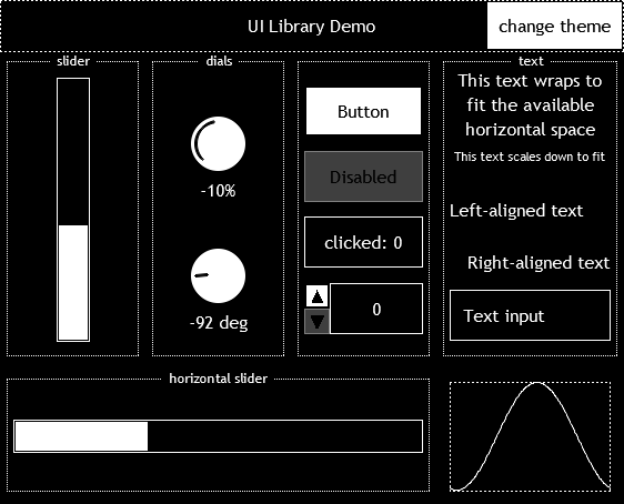
interacted = ui_interacted();Rich controls
The functions in this section provide a common set of rich interactive controls.
They have a distinct visual look (see control_start() for how to choose a theme), and attempt to present consistent interactions (e.g. double-click to reset to default value, drag up/down to adjust dials).
- Screen decoration and layout
- Buttons, readouts and switches
- Sliders
- Dials
- Text inputs
- Drawing your own controls
Screen decoration and layout
control_navbar()
action = control_navbar(#title)action = control_navbar(#title, #next_title, next_screen_id)#title#next_titlenext_screen_idaction- 0 or -1
Draws a navigation bar at the top of the viewport. This is probably the first thing you want to draw.
If this is not the first screen on the screen stack, it automatically adds a "back" button which returns to the screen below. If parameters for the next screen are supplied, a button drawn on the opposite side to the "back" button. When pressed, it opens the screen with the given ID.
The returned action is 0 if nothing was clicked and it expects to stay on this screen, -1 if "back" was clicked, and 1 if the next screen was clicked. These screens will be closed/opened automatically, so you only need to check if you want to perform an additional action (such as saving results or writing screen arguments). This also means that any screen arguments should be read *before* the call to control_navbar(), or they might be read from the incorrect screen.
Example:
control_navbar(#title, #next_title, "options");

ui_text("screen contents go here");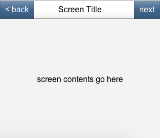
control_dialog()
action = control_dialog(#title)action = control_dialog(#title, #ok)action = control_dialog(#title, #ok, #cancel)action = control_dialog(#title, width, height, #ok, #cancel)#title#ok#cancelwidth- integer >= 0height- integer >= 0action- 0 or 1
Decorates the viewport to be a dialog. Afterwards, the viewport is inside the area of the dialog. This is probably the first thing you want to draw inside your screen.
The returned action is 0 if nothing was clicked and it expects to stay on this screen, -1 if "cancel" was clicked, and 1 if "OK" was clicked - if either of these is clicked, the screen will close itself, so you only need to check if you want to perform an additional action (such as saving results or writing screen arguments). This also means that any screen arguments should be read *before* the call to control_navbar(), or they might be read from the incorrect screen.
If "cancel" is omitted, then no cancel button will be displayed.
Example:
has_cancel ? (
	control_dialog(#title, #ok, #cancel);
) : (
	control_dialog(#title, #ok);
);

ui_text("dialog contents go here");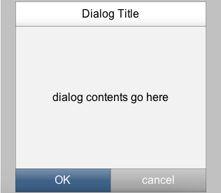
control_group()
This draws a labelled group indicator in the current viewport, and adds padding so that elements are placed inside this group.
Example:
control_group(#label);ui_text("Control group contents");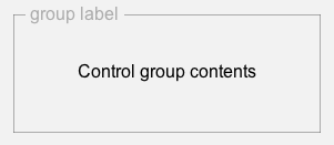
Buttons, readouts and switches
control_readout()/control_readoutnumber()control_button()control_selector()control_switch()control_radio()
control_readout() / control_readoutnumber()
Displays a non-interactive value display ("inset" style).
Example:
control_readout(#text);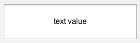
control_button()
Displays a button ("enabled" style). Triggers on mouse-up, and returns the time since mouse-down, or 0 if there was no click.
If "enabled" is 0, it is drawn using "disabled" style, and always returns 0 (ignoring clicks).
Example:
click = control_button(#text, enabled);
click_total += click;
control_selector()
Displays a selector for switching between a fixed number of values. If next_value or prev_value are equal to the current value, their corresponding controls are greyed-out.
Example:
sprintf(#selector_text, "option #%i", value);
// increment, maximum 10
next_value = min(10, value + 1);
// decrement, minimum 0
prev_value = max(0, value - 1);

value = control_selector(value, #selector_text,
		next_value, prev_value);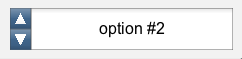
control_switch()
Displays an on/off switch for a boolean value.
Example:
bool_value = control_switch(bool_value);
control_radio()
Displays a radio-button control. This displays as selected if "option" and value are the same. Clicking it sets "value" to "option".
Example:
ui_split_topratio(1/3);
	ui_split_right(30);
		value = control_radio(value, 1);
	ui_pop();
	ui_text("one");
ui_split_next();
	ui_split_right(30);
		value = control_radio(value, 2);
	ui_pop();
	ui_text("two");
ui_split_next();
	ui_split_right(30);
		value = control_radio(value, 3);
	ui_pop();
	ui_text("three");
ui_pop();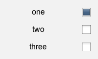
Sliders
value = control_slider_left(value, left_value, right_value, curve=0, default)value = control_slider_x(value, left_value, right_value, curve=0, default)value = control_slider_bottom(value, bottom_value, top_value, curve=0, default)value = control_slider_y(value, bottom_value, top_value, curve=0, default)valueleft_valueright_valuecurvedefaultbottom_valuetop_value
Draws a horizontal or vertical slider.
The "curve" parameter determines how the visual position of the slider corresponds to the actual values. Positive values give more accuracy on the left/top side, negative on the right/bottom. For a logarithmic scale, use curve=log(left_value/right_value).
Sliders with a particular side (e.g. "left") will show a link between the current value and that side. control_slider_x() and control_slider_y() will not show that link, but *may* show a link between the current value and the default value, if one is provided.
Example:
ui_split_topratio(1/4);
	ui_split_left(70);
		ui_text("curve=0");
	ui_pop();
	value = control_slider_left(value, 0, 1, 0, 0.5);
ui_split_next();
	ui_split_left(70);
		ui_text("curve=2");
	ui_pop();
	value = control_slider_left(value, 0, 1, 2, 0.5);
ui_split_next();
	ui_split_left(70);
		ui_text("curve=-2");
	ui_pop();
	value = control_slider_left(value, 0, 1, -2, 0.5);
ui_split_next();
	ui_split_left(70);
		ui_text("slider_x");
	ui_pop();
	value = control_slider_x(value, 0, 1, 0, 0.5);
ui_pop();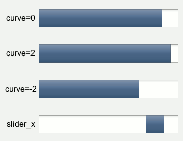
Dials
value = control_dial_left(value, left_value, right_value, curve=0, default)value = control_dial(value, left_value, right_value, curve=0, default)angle = control_dial_angle(angle, default)angle = control_dial_angle_unit(angle, default)valueleft_valueright_valuecurvedefaultangle
Draws a rotating dial. The "curve" parameter works the same was as for sliders.
Like sliders, control_dial_left() will show a link between the current value and the left value, and control_slider() will not show that link (but may show a link to the default value).
control_dial_angle() provides a dial that can rotate freely, returning a value between 0 and 2*PI, where 0 is vertical. control_dial_angle_unit() is similar, but uses values between 0 and 1.
Example:
ui_split_topratio(1/3);
	value = control_dial_left(value, 0, 1);
ui_split_next();
	value = control_dial(value, 0, 1);
ui_split_next();
	angle = control_dial_angle(angle, 0);
ui_pop();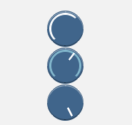
Text inputs
JSFX has no built-in text inputs, so this isn't quite as smooth as a native control, but it's functional. It supports selecting with the mouse (including double-clicking on words) or keyboard.
Text inputs pack their internal state into an opaque state value, which you need to store and pass back to it next time, otherwise they won't work. You should not store this state in presets/sliders, or attempt to manipulate it directly - use the appropriate functions.
If you want to enter interesting characters (like space) which would otherwise be handled by the host, put "options:want_all_kb" in the header of your effect.
control_textinput()control_textinput_focused()control_textinput_focus()control_textinput_unfocus()control_textinput_select()control_hidden_text()/control_hidden_textnumber()
control_textinput()
opaquestate = control_textinput(#text, opaquestate)#text- mutable stringopaquestate- opaque value used by the control, initialised to 0
Draws a text input, constantly updating the mutable string #text.
Example:
opaquestate = control_textinput(#text, opaquestate);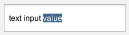
control_textinput_focused()
Returns whether the given text input currently has focus (i.e. is processing keyboard events).
Example:
control_textinput_focused(opaquestate) ? (
	/* do whatever */
);control_textinput_focus()
Demand focus for this input element
Example:
opaquestate = control_textinput_focus(opaquestate);control_textinput_unfocus()
Decline focus for this input element
Example:
opaquestate = control_textinput_unfocus(opaquestate);control_textinput_select()
opaquestate = control_textinput_select(opaquestate, cursor, select_end)opaquestatecursor- integerselect_end- integer
Changes the selection in the text input (but not the focus state).
Example:
should_select_all ? (
	state = control_textinput_select(state, 0, strlen(#my_text));
);

control_textinput(#my_text, state);
Drawing your own controls
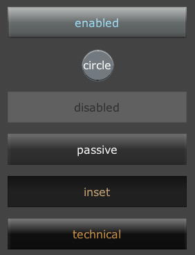
No UI library can provide everything, so it provides some ways to draw custom controls that fit into the theme.
Styling for custom controls
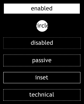
control_background_enabled(state="auto")control_background_disabled(state="auto")control_background_passive(state="auto")control_background_inset(state="auto")control_background_technical(state="auto")control_finish_enabled(state="auto")control_finish_disabled(state="auto")control_finish_passive(state="auto")control_finish_inset(state="auto")control_finish_technical(state="auto")state- "press", "hover", "drag", "none" or "auto"
These help you create custom controls that fit into the theme, by drawing a background and an overlay in the appropriate style, including setting an appropriate ui_color().
If state is omitted ("auto"), it is calculated using the current mouse interaction. However when creating a composite control it's useful to have a shared state (e.g. when any part of the control is pressed, the whole control displays as pressed).
Example:
ui_split_topratio(1/5);
	ui_pad();
	control_background_enabled(state);
	ui_text("enabled");
	control_finish_enabled(state);
ui_split_next();
	ui_pad();
	control_background_disabled(state);
	ui_text("disabled");
	control_finish_disabled(state);
ui_split_next();
	ui_pad();
	control_background_passive(state);
	ui_text("passive");
	control_finish_passive(state);
ui_split_next();
	ui_pad();
	control_background_inset(state);
	ui_text("inset");
	control_finish_inset(state);
ui_split_next();
	ui_pad();
	control_background_technical(state);
	ui_text("technical");
	control_finish_technical(state);
ui_pop();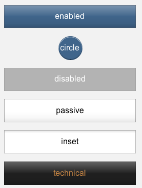
control_state()
This returns the current mouse-interaction state of the current viewport.
These values match what can be passed into control_background_*() and control_finish_*(). This lets you assemble a composite control that shares a single press/hover/drag state.
Reported states are "press", "hover", "drag" and "none", in that order of precedence - so if the user has clicked and dragged, but is still within the control (so it counts as a press), then it will report "press".
Example:
state = control_state();control_arrow()
Draws a triangle in the current viewport, using the current colour.
Example:
control_arrow(direction);
Retina support
pixel_scale = ui_retina()old_pixel_scale = ui_retina(new_pixel_scale)new_pixel_scalepixel_scale- The current pixel-scaleold_pixel_scale- the previous pixel scale, before it was changed
Support for Retina displays (double-resolution pixels on Macs) can be enabled by setting gfx_ext_retina=1. If Retina mode is active, the drawing area will be bigger, and mouse positions will be scaled - however, the UI library scales down its viewport/measurements so that it appears to be the same size.
However, if you need to draw your own custom controls, you now have a scaling factor to contend with.
The best way to handle this is ui_retina().
If called with no argument (or 0), ui_retina() returns the current pixels-scaling value (2 for retina displays, 1 otherwise). If called with an argument, it sets the pixel scaling value, and changes the viewport appropriately.
Be warned, however, that mouse positions (both mouse_x/mouse_y and functions like ui_mouse_x()) will remain scaled-down, so you might want to save the previous pixel-scaling value and restore it before the mouse-based calculations.
This state is stored in the viewport/drawing stack, so it will be restored on ui_pop().
Example:
// Reset to 1-to-1 scale
old_pixel_scale = ui_retina(1);

/* Draw something using viewport */
gfx_rect(ui_left(), ui_top(), ...);

//Set back to the old one
ui_retina(old_pixel_scale);

/* Logic involving mouse-pointer */
xratio = ui_mouse_xratio();